Before the Poster: How Handbills Set a Show in Motion
Handbills turned a show into a local invitation, revealing how promoters found audiences, shared essential details and adapted their message to the moment.
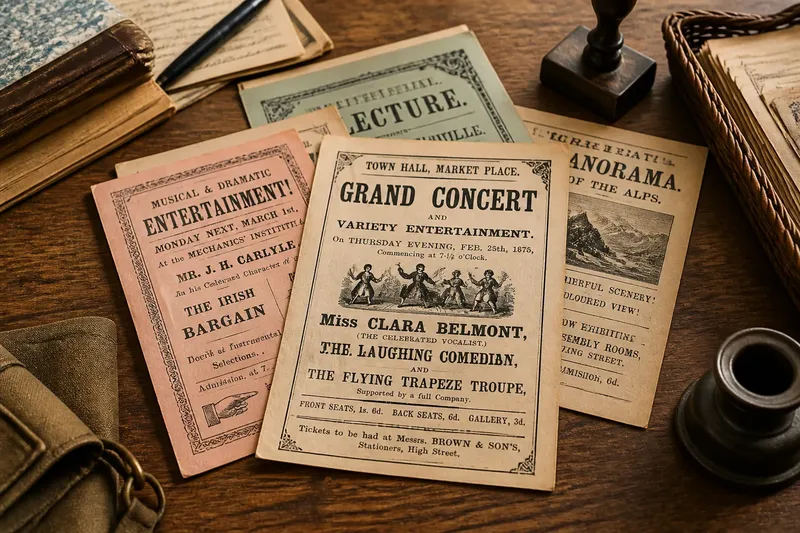
A handbill could put a performance in motion before anyone reached the venue: a small printed sheet carried the invitation into streets, shops and meeting places where potential audiences already spent time. To understand how handbills promoted a show, look beyond the headline. Paper size, wording, print method and distribution all reveal what a promoter needed people to know—and what they expected those people to do next.
Why did a show need a handbill?
A performance could not draw a crowd merely by existing. Someone had to make its date, location and appeal known to people likely to attend. In places where local entertainment depended on word of mouth, a handbill gave that message a physical form that could be carried, passed along or displayed.
“Handbill” describes a printed sheet distributed by hand, though the exact form varied. Some were plain notices; others used decorative type, illustrations or a denser arrangement of names and attractions. Unlike a large poster intended to catch attention from a distance, a handbill could be read up close and taken away. That made it useful for details an interested reader might want to remember.
The sheet also helped a promoter turn a general promise—there will be a show—into a specific invitation: this performance is here, at this time, and it offers something you may want to see. Its small scale did not make it unimportant. It made distribution flexible, especially where a large display was impractical or where a notice needed to reach people directly.
What did the format reveal about promotion?
A handbill’s design records choices about attention. The largest wording usually gave prominence to the show’s name, a leading performer, a special attraction or another claim thought likely to draw interest. Smaller type could then carry practical particulars, such as the venue and programme. A crowded sheet may suggest that promoters wanted to advertise several draws at once; a sparse one could make a single name or event stand out.
Typography did more than decorate. Bold lettering could make a title legible at a glance, while contrasting type styles separated the main attraction from supporting information. Ornament might give a notice a festive tone or help it stand out among other printed matter. But decorative flourishes could also compete with the details, particularly if the sheet had to communicate quickly.
Paper itself tells part of the story. A simple sheet could be economical to print and easy to distribute in quantity. More elaborate paper or image-making might signal a desire to present the event as special, though the appearance alone cannot prove how much was spent or how widely the notice circulated. Surviving handbills show what was printed, not necessarily what every intended reader saw.
Distribution shaped the format’s usefulness. A sheet handed to someone outside a venue could include enough information to make a decision later. A bill left at a shop or posted in a gathering place had to work without a promoter standing beside it to explain the event. The words therefore had to carry the invitation on their own.
Which details made the invitation usable?
Promotion required more than a persuasive claim. A reader also needed to identify the event and understand how to attend. Look for the relationship between the show’s appeal and its practical information: a striking title may win attention, but the date and place turn interest into a possible visit.
- Event identity: Does the sheet name the performance clearly, or rely on a phrase that could describe many entertainments?
- Attractions: Are performers, acts or special features named, and which appear most prominently?
- Time and place: Can a reader work out when and where the event is held without searching through decorative wording?
- Audience invitation: Does the language address a particular group, promise a certain kind of entertainment or leave the intended audience open?
- Action: Does the reader know whether to attend, enquire, reserve a place or look for another notice?
These clues should be read together rather than treated as a universal formula. A handbill might devote little space to logistics because a venue was already familiar to its intended audience. Another might spell out details because it sought people beyond a regular local circle. What looks like an omission to a later reader may have been clear in its original setting.
What can go wrong when we read a handbill now?
Old promotional sheets invite confident interpretations, but they are incomplete evidence. Their claims were designed to attract attention, not to provide a neutral account of the performance. A bold promise tells us what the promoter chose to advertise; it does not establish how the show felt to an audience or whether every announced feature appeared as described.
Does a large headline prove the act was the main event?
It shows that the promoter gave the name or claim strong visual prominence. It may have been intended to draw readers, but the layout alone cannot establish how long the act performed or how audiences ranked it.
Can the handbill tell us who attended?
It can suggest whom the wording addressed, especially when it names a community, occupation or type of occasion. It cannot by itself confirm who came, who stayed away or how the audience responded.
What if the date or venue is missing?
The sheet may be incomplete, or the information may have been supplied elsewhere, such as in a local notice or through word of mouth. Avoid filling the gap with a guess; note what is visible and keep any proposed explanation tentative.
Does a surviving copy show how common the handbill was?
No: one surviving sheet demonstrates that a version was printed, not how many copies were made or distributed. A single example may also have been kept precisely because it was unusual, so it cannot stand for every notice used by the event.
How should you trace the promotion in order?
A careful reading can move from the sheet itself to the likely work it performed without treating inference as fact. Keep the sequence simple: record what is visible, interpret the design, then ask what the document cannot answer.
- Describe the object. Note its shape, paper, printing and any visible wear or missing portions. Separate direct observations from assumptions about how it was handled.
- Read the hierarchy. Identify the words that dominate, then follow the smaller text. Ask what a passer-by might notice first and what an interested reader would need to find afterwards.
- Map the invitation. Pick out the named attractions, audience cues, date, venue and any requested action. If one is absent, record the absence rather than silently supplying it.
- Consider circulation. Ask whether the format seems suited to personal distribution, display or keeping for later reference. Treat this as a clue about possible use, not proof of a particular route.
- Mark the limits. Distinguish the promoter’s claims from information the sheet independently confirms. Look for other local material if you need to establish context, while keeping each source’s contribution clear.
Say you encounter a handbill for a neighbourhood music evening: the performers’ names fill the top, while the venue appears in small type near the bottom and no exact start time survives on the copy. You can reasonably observe that performer names were given visual priority and that the sheet identifies a place; you cannot infer from that fragment alone when the music began or which act drew the biggest crowd.
What is not worth the effort?
It is rarely useful to treat every decorative mark as a coded message or to reconstruct an entire audience from one sheet. A flourish may simply be ornament, and a missing detail may reflect damage or a separate source of information. Spend attention first on what the handbill actually communicates: the event’s public identity, its chosen selling points and the path it offers from seeing a notice to considering attendance.
That approach also keeps comparisons fair. A handbill with fewer details is not automatically less effective than a crowded one; it may have relied on a familiar venue or a well-known performer. Likewise, an ornate design does not establish a larger audience. The document reveals a promotional choice, while its reception requires evidence beyond the printed sheet.
Why do handbills still matter to show history?
Handbills preserve the meeting point between entertainment and everyday life. Their wording can show what promoters thought would persuade people, while their format hints at how the invitation might travel. The same sheet can therefore be read as both an advertisement and a record of the practical decisions behind making a performance visible.
For local show history, the most useful question is not simply what a handbill announced, but how it organised attention. Which name came first? What did the design make easy to see? Which details depended on local knowledge? Those questions help distinguish a promoter’s intended message from what the surviving evidence can support.
Read a handbill as a small piece of public action: it asked someone to notice, remember and consider attending. Its format reveals how that request was shaped for its time, while its silences remind us that promotion is not the performance itself. Keeping that distinction in view makes the handbill a sharper guide to how a show began to gather an audience.